Year
2019
Discipline
UI & UX
Branding
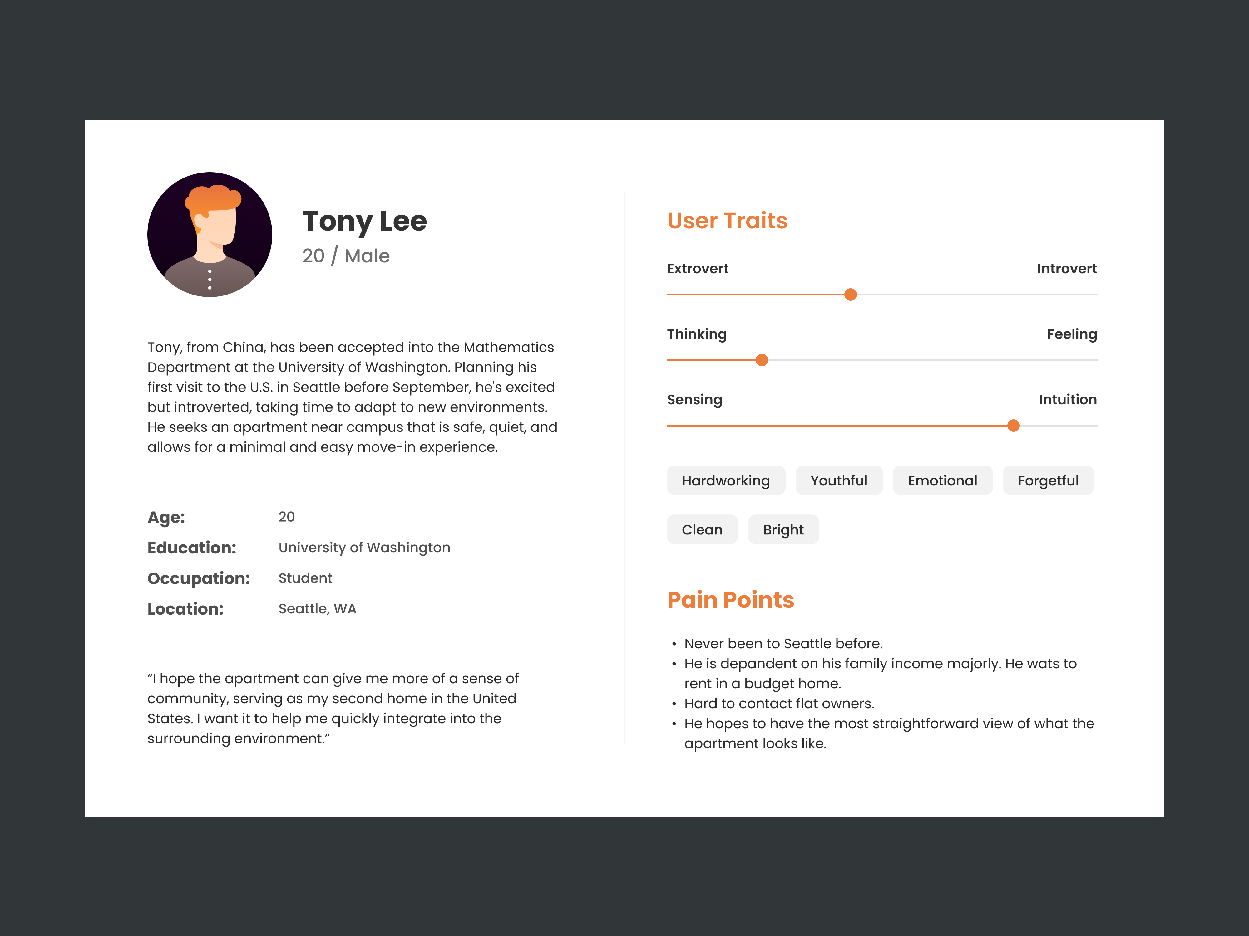
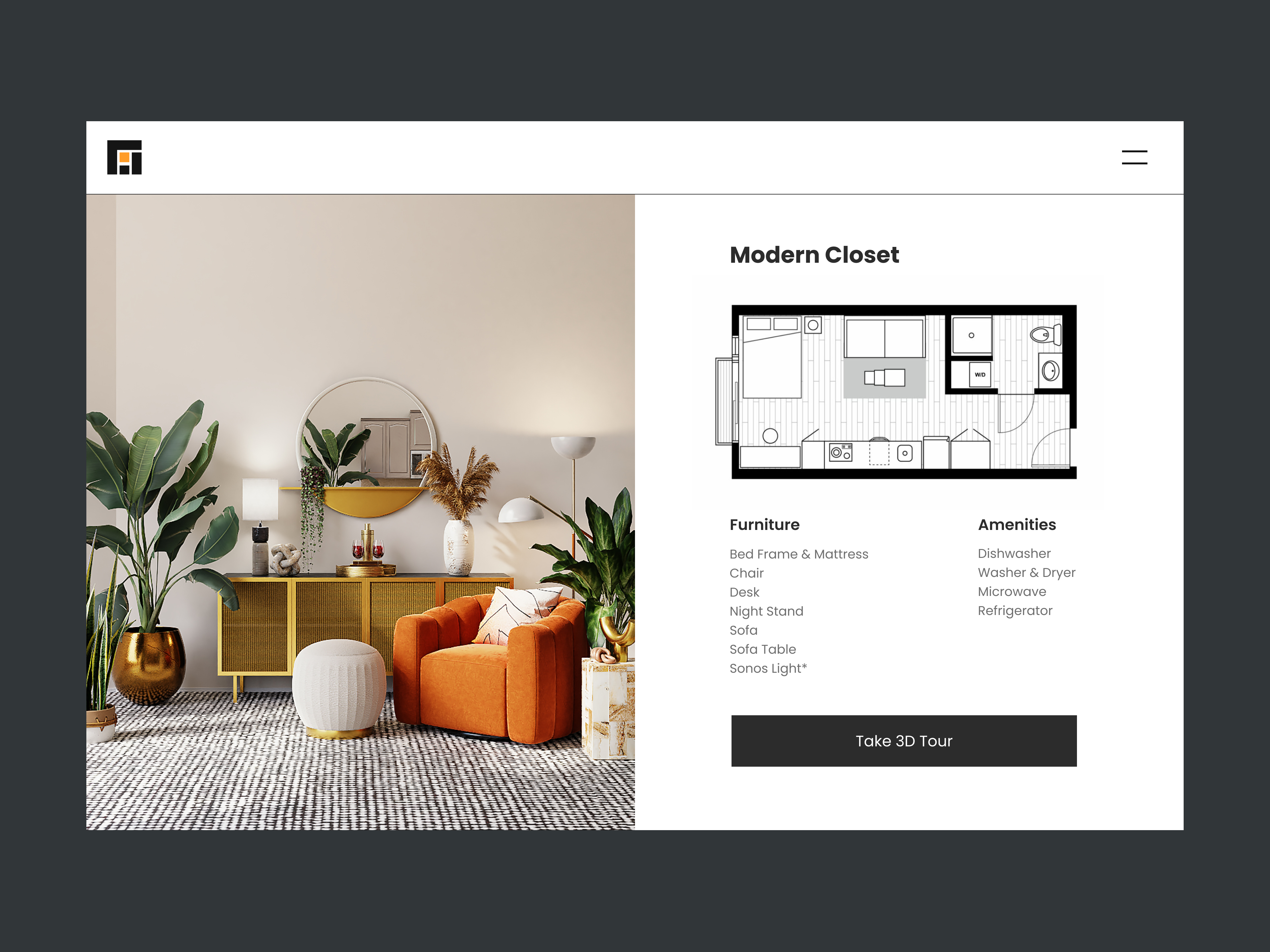
Every Ori community aims to make users feel at home, with careful design and operation focused on blending individuality with the Ori community and neighbors. We work closely with tenants through technical support to create worry-free living solutions for everyone.
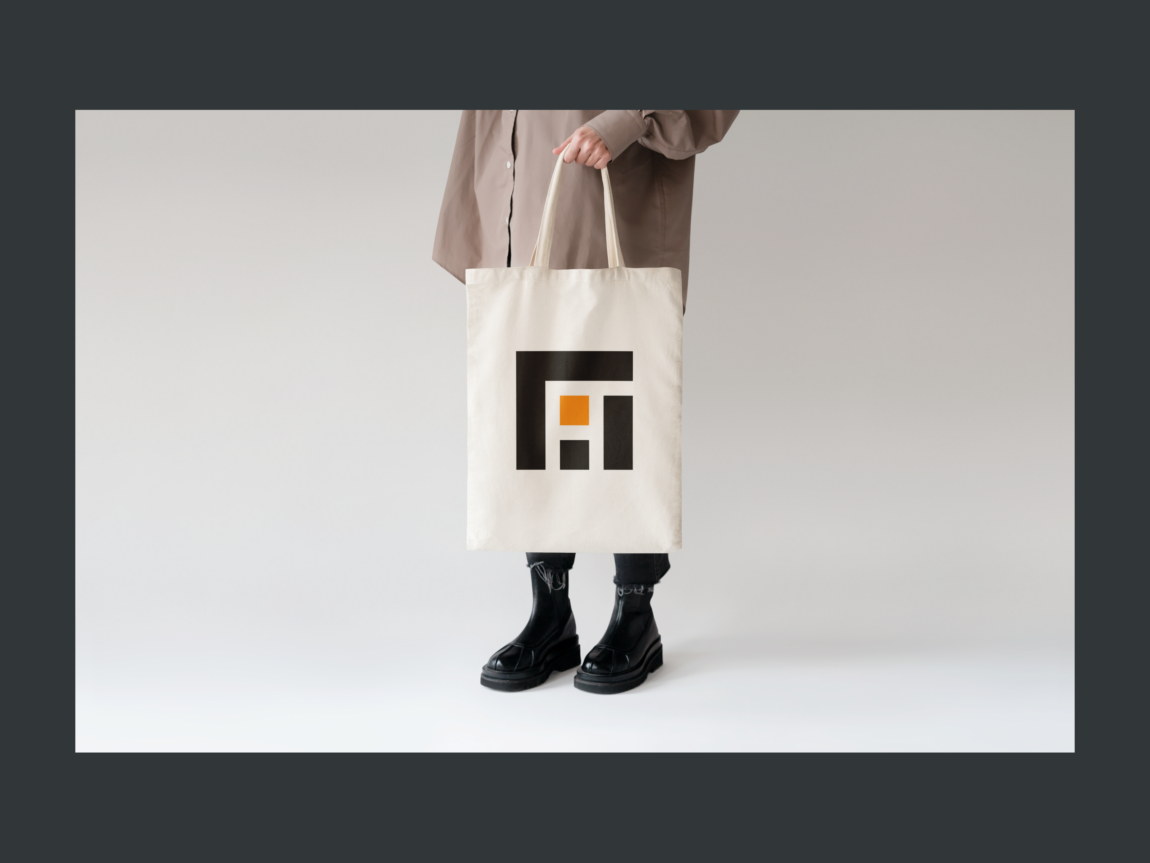
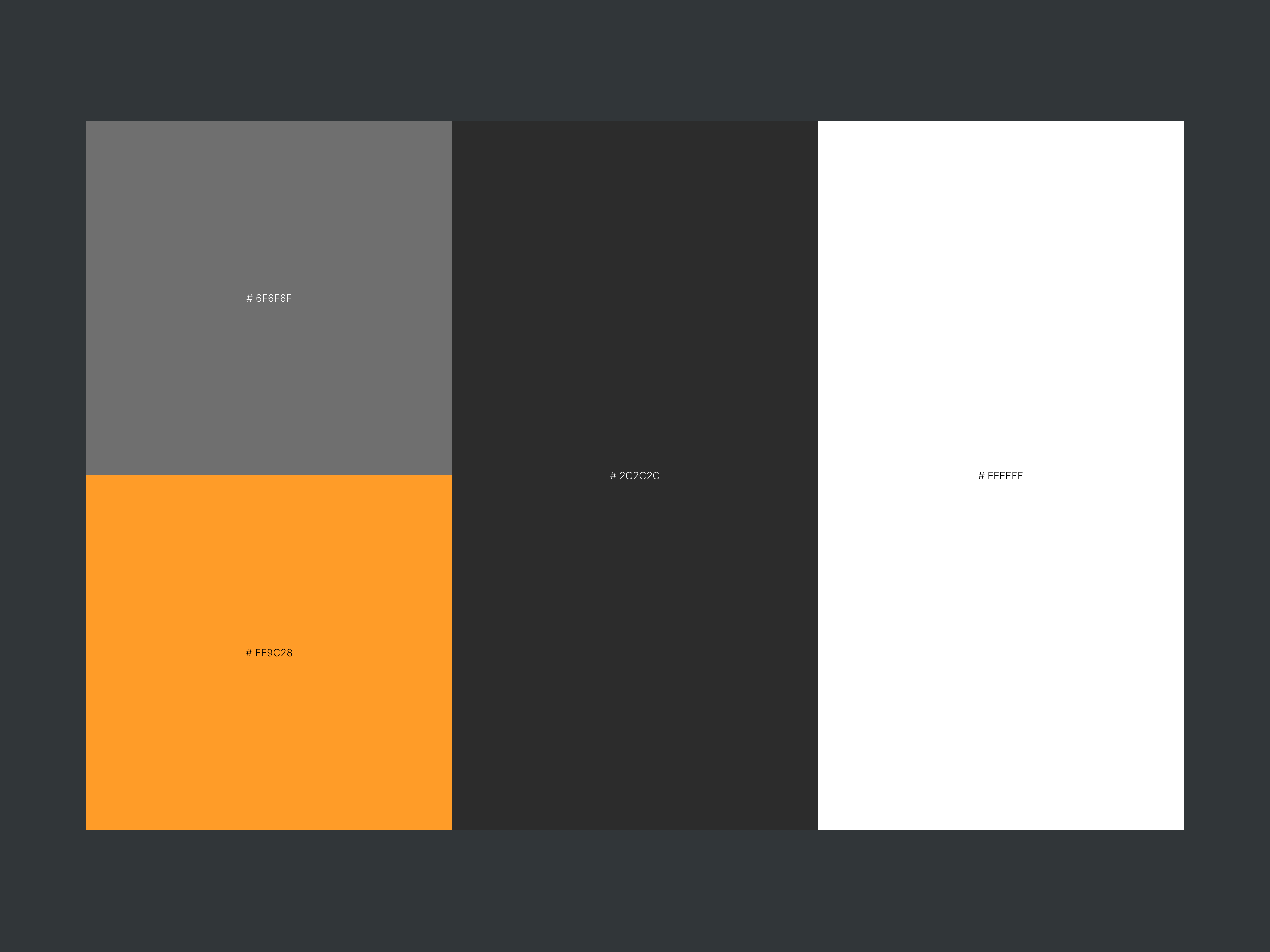
Ori's essence represents the purest origins, much like the warmth of home. The logo combines the '原' character with real estate elements. Ori uses the Poppins font family and embraces a minimalist design approach.